
Intro to Anomaly Detection
Getting Started with Anomaly Detection: A Comprehensive Guide for Novice


Before I start, let's have some motivation:
"People worry that computers will get too smart and take over the world, but the real problem is that they're too stupid and they've already taken over the world."
- Pedro Domingos
As you know, these days Generative AI is booming everywhere, and everybody talks about it, but I am not going to talk about it here sorry for that. In this blog, I am trying to explain you about anomaly detection from the ground level.

By the end of the blog, you’ll be able to:
Define anomalies
Define various types of anomalies
Discuss the various applications of anomaly detection
Describe the fundamental statistics involved in anomaly identification.
Apply anomaly detection to one-dimensional data using Python*.
Prerequisites
Basic Python knowledge
Probability and Statistics
1. What is Anomaly Detection?
Let's first define an anomaly to better comprehend anomaly detection. To put it simply, an anomaly is something that differs a lot from the rest of others. Data that significantly deviates from the rest of the data is referred to as an anomaly in the context of the data.
Anomaly is sometimes also called "abnormality" or "deviant", or "outlier".
All Observations = Normal Data + Outliers
Outliers = Noise + Anomalies
Noise = Uninteresting Outlier
Anomaly = Sufficiently Interesting Outlier
Now, Anomaly detection is nothing but detecting anomalies(anomalous data) from the collection of data(dataset) using different methods. It can be implemented using various techniques that we going to describe in this series.
2. Types of Anomalies
There are generally three types of anomalies that exist in the data. They are:
a. Point Anomalies
It is an individual data point that seems strange when compared with the rest of the data. For example, an unusually large credit card purchase.
b. Contextual Anomalies
These are the data that seem strange in a specific context but not otherwise. For example, A US credit card holder purchases in Japan.
c. Collective Anomalies
A collection of data points seems strange when compared with an entire dataset, although each point may be ok. For example, ten consecutive credit card purchases for a sandwich at hourly intervals.
3. Applications of Anomaly Detection
Fraud detection in a credit card purchase
Intrusion detection in the computer network
Fault detection in mechanical equipment
Earthquake warning
Automated Surveillance
Detect fake social media accounts
4. The Fundamental Idea of Anomaly Detection
Almost all anomaly detection algorithms take the following approach.
Create a model for what normal data should look like.
Calculate a score for each data point that measures how far from normal it is.
If the score is above a previously specified threshold, classify the point as an anomaly.
Depending on what you know, how you proceed will vary.
If you have examples of normal and anomalous data, you can use this information to find anomalies => Supervised Anomaly Detection
If you don't have any prior information about normal or anomalous data, you have to use a different approach. It requires probability and statistics to look for anomalies => Unsupervised Anomaly Detection
5. Review of Probability and Statistics
It would be better if we brush up on our probability and statistics knowledge before implementing the anomaly detection.
A. Probability Distribution
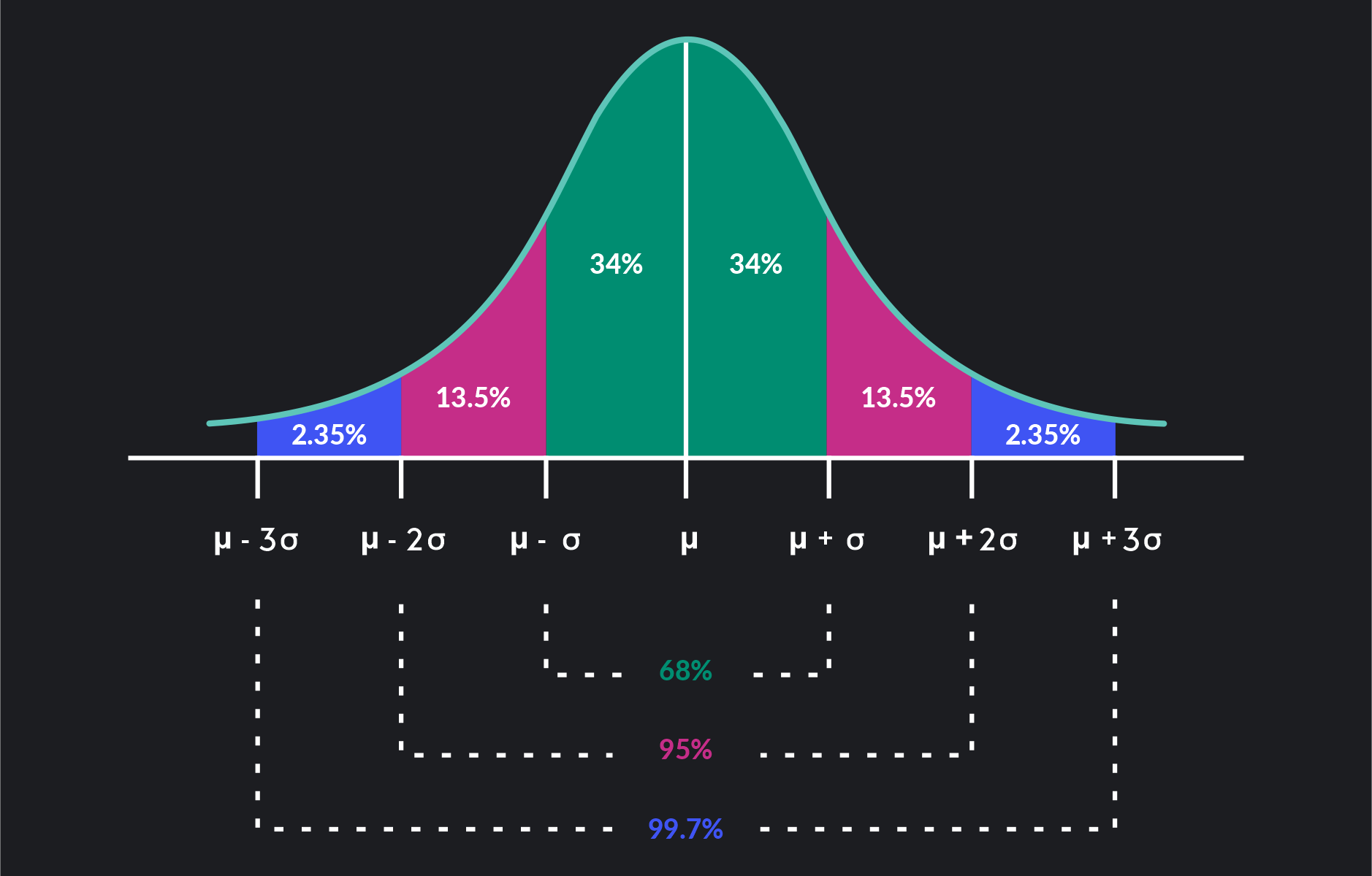
A probability distribution is a way to describe the likelihood of different outcomes or events occurring. It tells us how probable each outcome is within a given set of possibilities. The normal(Gaussian) distribution is the probability distribution most commonly used to model data. The figure below is the plot of normally distributed data.
Caution
- The normal distribution may not be appropriate for your specific data.
B. Cumulative Distribution Function
It describes the probability distribution of a random variable. The CDF gives the probability that the random variable takes a value less than or equal to a specific value. Mathematically, the CDF of a random variable X is defined as
F(x)=P(X≤x) In other words, for any real number ''x'', F(x) represents the probability that a random variable X is less than or equal to x.
C. Fundamental of Statistics
Mean: Expected value
$$\mu = E(X) = \sum_{i} x_i \cdot P(X = x_i)$$
where,
xi is the ith data point
P(X = xi) is the probability of getting an outcome
Other types of averages are
Median: The median is a measure of central tendency in a set of data. It represents the middle value when the data is arranged in ascending or descending order.
For example, in the dataset {3, 5, 1, 2, 4}, the median is 3 because when arranged in ascending order, 3 is in the middle.
Mode: The mode of a dataset is the value that appears most frequently. In other words, it is the data point that occurs with the highest frequency.
For example, in the dataset {3, 5, 1, 2, 4, 3, 3}, the mode is 3 because it appears more frequently than any other value.
Median and Mode are usually less affected by outliers than mean
Example: we have, values = 2, 3, 3, 4, 7, 8, 9
Its Mean = 5; Median = 4; Mode = 2
Now, introduce an outlier:
values = 2, 3, 3, 4, 7, 8, 30
Its Mean = 8; Median = 4; Mode = 2
Here, Mean changes, but median and mode do not. That's why the mean is more affected by outlier than mode and median.
Variance: The spread of the data about its mean.
For a discrete random variable:
$$\text{Var}(X) = \sigma^2 = \sum_{i=1}^{n} (x_i - \mu)^2 \cdot P(X = x_i)$$
If there is multivariate data, covariance is used instead of variance.
6. Statistical Tests
In anomaly detection, statistical tests are used to identify whether a particular observation or set of observations deviates significantly from what would be considered normal behavior. These tests help in distinguishing between normal variations in data and unusual patterns that may indicate anomalies.
A common method for scoring anomalies in 1D data is the z-score. If the mean and standard deviation are known, then for each data point calculate the z-score as
$$z_i = \frac{x_{i} - \bar X}{\rm MAD}$$
Where MAD is the mean absolute difference and is given by,
$$MAD = {mean(\lvert x_i - \bar X\rvert)}$$
And,
$$\bar X = Mean\hspace{0.1cm}of \hspace{0.1cm}x_i$$
The z-score measures how far a point is away from the mean as a signed multiple of the standard deviation. Large absolute values of the z-score suggest an anomaly.
A note of caution
Since the mean and standard deviation are themselves sensitive to anomalies, the z-score can sometimes not be trustable. The modified z-score tackles this problem by using medians instead:
$$y_{i} = \frac{x_{i} - \tilde X} {\rm MAD}$$
Where MAD is the median absolute difference:
$$MAD = {median(\lvert x_i - \tilde X\rvert)}$$
And,
$$\tilde X = Median\hspace{0.1cm}of \hspace{0.1cm}x_i$$
7. Implementation
It's already been a long theoretical kind of stuff, now I think it's time to switch to the implementation of all that theoretical stuff.

Almost all data science, analytics, and machine learning tasks are easy to implement in an interactive Python notebook, I am highly encouraging you to use either Jupyter Lab, Notebook, or Google Colab.
Let's first try to understand the probability distribution function and cumulative distribution function practically.
Import the required libraries
import random
import pandas as pd
import numpy as np
import matplotlib.pyplot as plt
from scipy.stats import norm

%matplotlib inline
To implement normal distribution we have to set the mean to 0 and the standard deviation to 1.
# Set the mean and standard deviation for the normal distribution
mu = 0
sigma = 1
Generate univariate data for demonstration.
# Generate a range of values for the x-axis
x = np.linspace(-3, 5, num=150)
Check shape
print(x.shape)
The output will be:
(150,)
Create a function that will calculate the probability distribution function (PDF) for each x.
def pdf_univariate_normal(x, mean, variance):
    """pdf of the univariate normal distribution."""
    return ((1. / np.sqrt(2 * np.pi * variance)) *
            np.exp(-(x - mean)**2 / (2 * variance)))
Calculate the probability distribution function (PDF) for each x using the manual function.
pdf_m = pdf_univariate_normal(x, mu, sigma)
print(pdf_m.shape)
print(pdf_m[0])
The output will be:
(150,)
0.0044318484119380075
To better understand let's plot the probability distribution function for each x with different mean and standard deviation.
# Plot different Univariate Normals using manual function
fig = plt.figure(figsize=(5, 3))
plt.plot(
    x, pdf_univariate_normal(x, mean=0, variance=1),
    label="$N(0, 1)$")

plt.plot(
    x, pdf_univariate_normal(x, mean=2, variance=3),
    label="$n(2, 3)$")

plt.plot(
    x, pdf_univariate_normal(x, mean=0, variance=0.2),
    label="$n(0, 0.2)$")
plt.xlabel('$x$', fontsize=13)
plt.ylabel('density: $p(x)$', fontsize=13)
plt.title('Univariate normal distributions')
plt.ylim([0, 1])
plt.xlim([-3, 5])
plt.legend(loc=1)
fig.subplots_adjust(bottom=0.15)

plt.show()
The plots will look like:
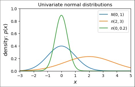
As you can see, the plot of probability distribution with mean=0 and standard deviation=1 is an exact normal distribution while varying the mean and standard deviation, we obtained different curves.
Now, let's implement the cumulative distribution function.
# Calculate the cumulative distribution function (CDF) for each x
cdf = norm.cdf(x, mu, sigma)
Plot the value:
# Plot the CDF
plt.subplot(1, 2, 2)
plt.plot(x, cdf, label='CDF', color='orange')
plt.title('Cumulative Distribution Function (CDF)')
plt.xlabel('x')
plt.ylabel('Cumulative Probability')
plt.legend()

plt.show()
Let's see what will output looks like.

As you can see, it's like a plot of a sigmoid function where each value ranges between 0 and 1.
PDF vs CDF
Both are useful for anomaly detection
If you want to identify anomalies as low-probability events, then using a probability distribution is straightforward.
For visual inspection of anomalies, the CDF is often more robust.
Let's perform actual anomaly detection.
Statistical Test
Import scipy package.
import scipy.stats as ss
Z-score in action
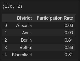
Download the dataset from here
Goal: Identify schools with low participation rates. This will help these schools improve their participation rates.
Load the dataset.
df = pd.read_csv('SAT_CT_District_Participation_2012.csv')
print(df.shape)
print(df.head())
Output:
a. Z-Score
We will start by assuming that the data can be represented by a normal distribution (we will confirm this later). The z-score will be used to identify anomalies. Because we are worried about low participation rates and are looking for schools with rates that are lower than the average, our cutoff will be a negative number. We decide on this point. Stated differently, a school will be deemed abnormal if its z-score falls below -2.
Note that for bigger datasets, larger absolute values of z (typically z = 3) are often used as a threshold. Because we have a small dataset, a large value of z might lead to no data being labeled as an anomaly. Also, we were conservative in our choice of z because we wanted to help as many schools as possible.
Let's first calculate the mean and standard deviation of the data.
mean_rate = df['Participation Rate'].mean()
stdev_rate = df['Participation Rate'].std(ddof=0)
Here, ddof is the degrees of freedom correction in the calculation of the standard deviation. For population standard deviation ddof=0
let's print the mean and std.
print('Mean participation rate is {:.3f}'.format(mean_rate))
print('Standard deviation is {:.3f}'.format(stdev_rate))
The mean participation rate is 0.741 Standard deviation is 0.136
Now, calculate the z-score for each data point and add it to a new column z-score.
zscore_rate = ss.zscore(df['Participation Rate'], ddof=0)
df = df.assign(zscore=zscore_rate)
print(df.head(8))

Now identify the anomalies and plot the results.
def plot_anomaly(score_data, threshold):
    # Mask to plot values above and below threshold in different colors
    score_data = score_data.copy().sort_values(ascending=False).values
    ranks = np.linspace(1, len(score_data), len(score_data))
    mask_outlier = (score_data < threshold)


    plt.figure(dpi=150)
    plt.plot(ranks[~mask_outlier], score_data[~mask_outlier],'o', color='b',label='OK schools')
    plt.plot(ranks[mask_outlier], score_data[mask_outlier],'o', color='r', label='anomalies')
    plt.axhline(threshold,color='r',label='threshold', alpha=0.5)
    plt.legend(loc = 'lower left')
    plt.title('Z-score vs. school district', fontweight='bold')
    plt.xlabel('Ranked School district')
    plt.ylabel('Z-score')
    plt.show()

plot_anomaly(df['zscore'], -2)

From the plot, it is clear that 4 anomalous points are detected. Finally, get a list of the schools that are anomalies.
zscore_anomalies = df[(df['zscore'] < -2)]
print(zscore_anomalies)

We have found our anomalies, but we still have one thing to do: check our assumption that the data can be modeled approximately as a normal distribution. If this is the case, then we have completed our test. If it isn't, then we cannot connect the z-score with probabilities as we did earlier in this notebook.
First, let's bin the data and see what it looks like as a histogram.
nbins= 20
n_hist, bins_hist, patches_hist = plt.hist(df['Participation Rate'], nbins, density=False,
                           cumulative=False, linewidth=1.0, label='data')

This histogram has two maxima and is skewed left, so it is not likely to be normal.
We can also compare the cumulative distribution function for our data with the CDF of a normal distribution with the same mean and standard deviation of our data.
num_bins = 130
normal_dist = [random.gauss(mean_rate, stdev_rate) for _ in range(500)]
n, bins, patches = plt.hist(df['Participation Rate'], num_bins, density=True, histtype='step',
                           cumulative=True, linewidth=1.0, label='data')
plt.hist(normal_dist, num_bins, density=True, histtype='step',
                           cumulative=True, linewidth=1.0, label='normal distribution')
plt.grid(True)
plt.legend(loc='upper left')
axes = plt.gca()
axes.set_xlim([0.2,1.0])
plt.xlabel('Participation Rate')
plt.ylabel('Cumulative probability')
plt.show()
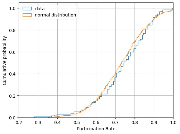
Again, we see a difference. If these two visual tests had not been decisive, we could carry out numerical tests for normality (such as the Shapiro-Wilk test).
Even though our data is inconsistent with a normal distribution, both the z-score and the modified z-score did help us identify outliers. So while we cannot make any probabilistic claims based on the z-scores, we can confidently focus our these four schools.
b. Z-Score vs Modified Z-score
Let's understand how the modified z-score helps us to improve the result of previous anomaly detection.
The formula for the modified z-score is
$$y_{i} = (x_{i} - \tilde X)/{\rm MAD}$$
Where MAD is the median absolute difference:
$$MAD = {median(\lvert x_i - \tilde X\rvert)}$$
And,
$$\tilde X = Median\hspace{0.1cm}of \hspace{0.1cm}x_i$$
Here we are going to make a slight modification and introduce a consistency correction k, which allows us to use MAD as a consistent estimate for the standard deviation. The value of k depends on the underlying distribution of the data. For simplicity, we will use the value for a normal distribution k=1.4826 (see.
Note: The correction factor of k=1.4826 still assumes the underlying data is normal!
So the modified z-score becomes
$$y_{i} = (x_{i} - \tilde X)/(k*{\rm MAD})$$
Create a function that computes the modified z-score.
def modified_zscore(data, consistency_correction=1.4826):
    """
    Returns the modified z score and Median Absolute Deviation (MAD) from the scores in data.
    The consistency_correction factor converts the MAD to the standard deviation for a given
    distribution. The default value (1.4826) is the conversion factor if the underlying data
    is normally distributed
    """
    median = np.median(data)

    deviation_from_med = np.array(data) - median

    mad = np.median(np.abs(deviation_from_med))
    mod_zscore = deviation_from_med/(consistency_correction*mad)
    return mod_zscore, mad
Find the median of the Participation rate
median_rate = np.median(df['Participation Rate'])
print(median_rate)
0.745
Call the function to get the modified z-score.
mod_zscore_rate, mad_rate = modified_zscore(df['Participation Rate'])
low_rates = df.assign(mod_zscore=mod_zscore_rate)
Now identify the anomalies and plot the results.
def plot_anomaly_goals_2(score_data, threshold):
    score_data = score_data.copy().sort_values(ascending=False).values
    ranks = np.linspace(1, len(score_data), len(score_data))
    mask_outliers = (score_data > threshold)

    plt.figure(dpi=150)
    plt.plot(ranks[mask_outliers], score_data[mask_outliers],'o', color='r',label='anomalies')
    plt.plot(ranks[~mask_outliers], score_data[~mask_outliers],'o', color='b', label='typical player')
    plt.axhline(threshold,color='r',label='threshold', alpha=0.5)
    plt.legend(loc = 'upper right')
    plt.title('Modified z-score vs. player', fontweight='bold')
    plt.xticks(np.arange(0, 21, step=2.0))
    plt.xlabel('Player')
    plt.ylabel('Modified z-score')
    plt.show()

plot_anomaly(low_rates['mod_zscore'], -2)

mod_zscore_anomalies = low_rates[(low_rates['mod_zscore'] < -2)]
print(mod_zscore_anomalies)

Here, we can see, that we got one extra district which was not given by the previous z-score. This shows the modified z-score did its part.
Let's use one more dataset to implement anomaly detection. For this, we are going to use a different dataset that you can download from here.
Now, load the dataset.
top_goals = pd.read_csv('world_cup_top_goal_scorers.csv',
                        encoding='utf-8',
                        names=['Year', 'Player(s)', 'Goals'], skiprows=1)
print(top_goals.head(5))

Once again will start by using the z-score to identify anomalies. As we are interested in the superstars with the highest number of goals, this time we will have an upper threshold. We choose z = +2. Above this z-score, any player will be labeled as an anomaly.
mean_goals = top_goals['Goals'].mean()
stdev_goals = top_goals['Goals'].std(ddof=0)
print('Mean number of goals is {:.2f}'.format(mean_goals))
print('Standard deviation is {:.2f}'.format(stdev_goals))
Output:
Mean number of goals is 7.05
Standard deviation is 2.15
Calculate the z-score for each player and add the result to the data frame.
zscore_goals = ss.zscore(top_goals['Goals'], ddof=0)
top_goals = top_goals.assign(zscore=zscore_goals)
print(top_goals.head(21))
Output:

Now identify the anomalies and plot the results.
def plot_anomaly_goals(score_data, threshold):
    score_data = score_data.copy().sort_values(ascending=False).values
    ranks = np.linspace(1, len(score_data), len(score_data))
    mask_outlier = (score_data > threshold)

    plt.figure(dpi=150)
    plt.plot(ranks[mask_outlier], score_data[mask_outlier], 'o', color='r', label='anomalies')
    plt.plot(ranks[~mask_outlier], score_data[~mask_outlier], 'o', color='b', label='typical player')
    plt.axhline(threshold,color='r', label='threshold', alpha=0.5)
    plt.legend(loc='upper right')
    plt.title('Z-score vs. player', fontweight='bold')
    plt.xticks(np.arange(0, 21, step=2.0))
    plt.xlabel('Player Rank')
    plt.ylabel('Z-score')
    plt.show()

plot_anomaly_goals(top_goals['zscore'], 2)
Output:

As you can see from the above figure, only one player is detected.
zscore_anomalies_players = top_goals[(top_goals['zscore'] > 2)]
print(zscore_anomalies_players)
Output:

Only one player is picked out: Just Fontaine.
Fontaine was indeed an amazing player, but clearly, our analysis is flawed. By looking at the plot, we see that in 12 out of 21 competitions, the top goalscorer(s) scored less than the mean number of goals (7.05).
Question: What's going on?
Answer: We are seeing an effect we discussed in lectures---the mean and standard deviation are themselves susceptible to the presence of anomalies. With his 13 goals, the amazing Fontaine is raising the mean so much that most players fall below it. As a result, he becomes the only anomaly.
Let's repeat this analysis with the modified z-score and see what happens.
median_goals = np.median(top_goals['Goals'])
print(median_goals)
Output:
6.0
As before, compute the modified z-score for all players then plot and list the results. Note that the threshold remains the same at y = +2.
mod_zscore_goals, mad_goals = modified_zscore(top_goals['Goals'])
top_goals = top_goals.assign(mod_zscore=mod_zscore_goals)
Plot and detect anomalies.
def plot_anomaly_goals_2(score_data, threshold):
    score_data = score_data.copy().sort_values(ascending=False).values
    ranks = np.linspace(1, len(score_data), len(score_data))
    mask_outliers = (score_data > threshold)

    plt.figure(dpi=150)
    plt.plot(ranks[mask_outliers], score_data[mask_outliers],'o', color='r',label='anomalies')
    plt.plot(ranks[~mask_outliers], score_data[~mask_outliers],'o', color='b', label='typical player')
    plt.axhline(threshold,color='r',label='threshold', alpha=0.5)
    plt.legend(loc = 'upper right')
    plt.title('Modified z-score vs. player', fontweight='bold')
    plt.xticks(np.arange(0, 21, step=2.0))
    plt.xlabel('Player')
    plt.ylabel('Modified z-score')
    plt.show()

plot_anomaly_goals_2(top_goals['mod_zscore'], 2)
Output:

After using a modified z-score, we are getting four players.
mod_zscore_anomalies_players = top_goals[(top_goals['mod_zscore'] > 2)]
print(mod_zscore_anomalies_players)
Output:

Sandor Kocsis, Eusebio, Gerd Muller along Just Fontaine are detected as an anomaly which is quite an impressive result.
Question: How does the MAD compare with the standard deviation calculated previously?
print('The value of MAD is {:.2f}'.format(mad_goals))
Output:
The Mean Absolute Deviation (MAD) measures how spread out a set of values is. If the MAD is 1.00, it means, on average, the values are about 1 unit away from the mean.
When we multiply the MAD by a constant factor (let's call it 'k'), we get a new value. In this case, k * MAD equals 1.48.
Now, compare this to the standard deviation, which is another measure of how spread out the values are. The standard deviation in this case is 2.15.
What we observe is that k * MAD (1.48) is smaller than the standard deviation (2.15). This indicates that the anomalies, or unusual values, in the data, have a bigger impact on the standard deviation than they do on the MAD.
Why does this happen? Well, the standard deviation takes into account not only how far each value is from the mean (like the MAD), but also the square of those differences. This means that outliers, or anomalies, can have a larger effect on the standard deviation since squaring magnifies their impact.
On the other hand, the MAD simply looks at the absolute differences from the mean without squaring them, so outliers don't have as much influence on it.
8. Conclusion
If you are with me up until this point, I would be very thankful to you. After acquiring knowledge of anomaly detection, you can now go further into more advanced theoretical aspects of anomaly detection. Additionally, you implemented the anomaly detection on the simple one-dimensional dataset using simple statistics tests which going to pave a path to anomaly detection for you.
Specifically, you have gained knowledge of:
Anomalies
Various types of anomalies
Various applications of anomaly detection
The fundamental statistics involved in anomaly identification.
Applying anomaly detection to one-dimensional data using Python*.
If you still have questions, don’t hesitate to reach out to me at suraj.karki500@gmail.com or in the comments section below!
If you want to learn more theoretical kinds of stuff, please check out the references below.
Identification of Outliers by D.M. Hawkins (Champan & Hall 1980)
Outlier Analysis by C.C. Aggarwal (Springer 2013) – The first chapter is available free
This much for today; see you in the next blog. Take care! Cheers!