
Anomaly Detection Using Probabilistic and Dimension-Based Models
Get Started with Extreme Value Analysis, Angle-based and Depth-based Techniques to Detect Anomalies


Before I start, let's have some motivation:
"Great things happen to those who don't stop believing, trying, learning, and being grateful."
- Roy T. Bennett
This is the second lesson of the Anomaly Detection lecture series. In this lesson, you going to see how we can implement the probabilistic and dimension-based methods to implement anomaly detection, so stay with me.

By the end of the blog, you will be able to:
Know probabilistic models for anomaly detection
Apply extreme value analysis
Apply angle-based and depth-based techniques
Apply anomaly detection on one- and two-dimensional data using Python*.
Prerequisites
Basic Python knowledge
Probability and Statistics
Linear Algebra
It would be better if you would watch my previous lesson in this series.
1. What are probabilistic models?
Probabilistic models are mathematical frameworks used to represent uncertain or stochastic systems. These models capture the randomness or uncertainty inherent in real-world phenomena by assigning probabilities to different outcomes. In probabilistic models, variables are treated as random variables, meaning their values are not fixed but instead governed by probability distributions. These distributions represent the likelihood of different values occurring.
Typical Workflow of Determining Anomalies using Probabilistic Models
Choose an appropriate model for your data.
Select a probability threshold below which you will label the data an anomaly.
Calculate the probability of observing each instance of your data.
Those instances which fall below the threshold are anomalies.
Let's understand this with an example.
imagine you're investigating potential match-fixing in the 2018 World Cup soccer matches. As a preliminary check, you focus on the number of goals scored in each match. Let's call this number 'n', where 'n' could be 0, 1, 2, 3, and so on. Here's the approach: before examining any data, you decide on a threshold for what would be considered an unusual number of goals. You set this threshold at any probability below 2%. This means that if the chance of observing a particular number of goals (say, 3 goals) is less than 2%, you'd flag that match as an anomaly.
Note of a Caution
Discovering anomalies doesn't imply that match-fixing has been detected;
It means you should look at the anomalous matches more closely.
It is still possible that the matches with 7 goals happened by chance.
Other sources of problems with probabilistic models for anomaly detection are: - model is inappropriate - parameters are wrong - test statistic is poorly chosen
2. Extreme Value Analysis
Extreme value analysis (EVA) is a statistical method used to study the behavior of extreme events or extreme values within a dataset. It focuses on understanding the tail behavior of distributions, particularly the distribution's upper or lower extremes. It is also used in the anomaly detection.
Motivation
- Sometimes an anomaly is an extreme event: a very big insurance loss, a very large flood, a very hot summer, etc.
But the problem with this is
- Extreme events are rare, so are hard to model with typical probability distribution because there is very little data.
Here, we use extreme value analysis to detect anomalies in real-world data: ozone levels in the New York metropolitan area. Near ground level, ozone is a respiratory hazard as it can cause damage to mucous and respiratory tissues. The air quality index (AQI) for ozone is a scale from 0 to 500 that describes the level of ozone pollution: the higher the number, the greater the hazard. More details about the scale can be found here: airnow.gov/aqi/aqi-basics The ozone AQI levels for the New York metropolitan area are taken from the US Environmental Protection Agency website: epa.gov/outdoor-air-quality-data/air-qualit.., (Geographic Area is "New York-Newark-Jersey City")
All full years available were selected (1980-2017) and the data for all years were combined into a single CSV file. You can download it from here.
Let's first load the dataset using the pandas library.
import pandas as pd

ozone_aqi = pd.read_csv('aqidailyozone.csv',
                        index_col=0,
                        parse_dates=True)
print(ozone_aqi.info())
Output:
tmp/ipykernel_16273/310078390.py:1: UserWarning: Could not infer format, so each element will be parsed individually, falling back to `dateutil`. To ensure parsing is consistent and as-expected, please specify a format.
  ozone_aqi = pd.read_csv('aqidailyozone.csv',
<class 'pandas.core.frame.DataFrame'>
DatetimeIndex: 13880 entries, 1980-01-01 to 2017-12-31
Data columns (total 1 columns):
 #   Column           Non-Null Count  Dtype
---  ------           --------------  -----
 0   Ozone AQI Value  13880 non-null  int64
dtypes: int64(1)
memory usage: 216.9 KB
As we can see above, there is only a single column Ozone AQI Value where all values are non-null values.
Let's perform two quick checks on the data. First, look for missing values.
print(ozone_aqi.isnull().values.any())
Output:
False
import matplotlib.pyplot as plt

date_range = pd.date_range(start="1980-01-01", end="2017-12-31", freq="D")

# Plotting
plt.figure(figsize=(10, 6))
plt.plot(date_range, ozone_aqi, label='Daily Values', color='blue')

# Adding labels and title
plt.xlabel('Date')
plt.ylabel('Value')
plt.title('Ozone AQI (1980-2017)')
plt.legend()
plt.grid(True)

# Show plot
plt.show()
Here, we plot the values of ozone levels from the data from 1980-01-01 to 2017-12-31.

Good. No missing values. Second, check that the number of rows is equal to the number of days from 1/1/1980 to 12/31/2017 (inclusive). Because we know the dataset contains the ozone level of each day from 1/1/1980 to 12/31/2017.
import datetime

d0 = datetime.date(1980, 1, 1)
d1 = datetime.date(2017, 12, 31)
difference = d1 - d0

# Last day is not included in the difference, so add one to account for it
print('Number of days is {}'.format(difference.days+1))
print('Number of rows is {}'.format(ozone_aqi.shape[0]))
Output:
Number of days is 13880
Number of rows is 13880
Again, good.
Now, there is a challenge with modeling extreme events in Extreme Value Analysis.
From the World Cup matches discussed previously, we can calculate the probability of scoring 12 goals in a match: it is about 1 in 100,000
Sounds very, very unlikely, but it happened.
The probability estimate is suspect. Why? The data used to calculate the parameter λ only includes matches with 0 to 8 goals scored. It is unlikely to capture the behavior of extreme events
So, the question is "How do you predict events outside the range of observations?". It turns out, we have two practical approaches.
Block Maxima: Take one maximum value per unit of time(often annual)
Peaks over threshold: Take all values over a specific threshold
Generalized Extreme Value Theorem:
The standardized GEV theorem is given by:

As long as the underlying distribution of your data is not too strange, then regardless of what this distribution is, maxima of samples of size 'n' will follow a GEV distribution if n is large enough.
So if you have enough data, you can use it to determine the three parameters that describe your GEV.
Once you have your complete GEV(with parameters), you can answer questions such as, "How likely is it to exceed a certain value in a given unit of time?
Let's study both approaches to solving the problem in extreme value analysis one by one.
a. Block Maxima
Workflow of Block Maxima
Divide your data into blocks of fixed size. Typically, the size is one year.
For each one-year block, find the maximum value. For a yearly division, the collection of maxima is known as an Annual Maximum Series (AMS).
Fit the AMS data with GEV distribution. Extract the shape, location, scale, and parameters.
Where judgment is needed: how to divide the data into blocks
We'll start with block maxima. The first step is to generate the annual maxima series (AMS), which consists of the maximum ozone AQI value for each year. We extract the AMS from the daily data.
year_grouper = pd.Grouper(freq='A')
ams = ozone_aqi.groupby(year_grouper).max()
print(ams)
print('')
print('Number of AMS entries is {}'.format(len(ams)))
Output:
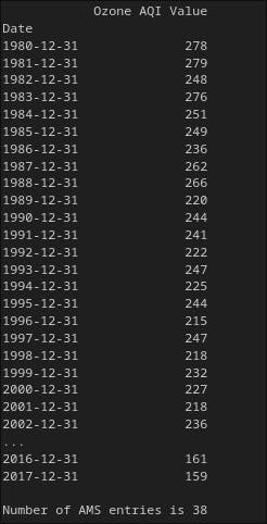
As you can see from above, we have now only 38 entries.
NOTE: Grouping by maximum has also produced the maximum in the index (i.e. the date is always December 31st, as that is the maximum date). These two maxima are taken independently, we are not just getting the AQI on December 31st.
Fit the AMS to a generalized extreme value (GEV) distribution. We'll use the statistical functions in scipy.stats
import scipy.stats as ss

fit = ss.genextreme.fit(ams)
print("Shape: ", fit[0])
print("Location: ", fit[1])
print("Scale: ", fit[2])
Output:
Shape:  0.48070190276858693
Location:  212.9835530676018
Scale:  36.562050718746406
These are the shape, location, and scale parameters, respectively.
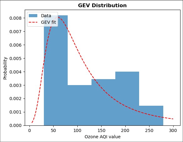
Now, plot the distribution using matplotlib.
import numpy as np

plt.hist(ams.iloc[:,0], bins=5, density=True, alpha=0.7, label='Data')
plt.plot(np.linspace(100, 300, 100),
         ss.genextreme.pdf(np.linspace(100, 300, 100), fit[0], fit[1], fit[2]), 'r--',
         label='GEV fit')
plt.title('GEV Distribution', fontweight='bold')
plt.xlabel('Ozone AQI value')
plt.ylabel('Probability')
plt.legend(loc='upper left')
plt.show()
Output:

The fit captures the general trend, but it is not as great as can be seen by the eye. (Further statistical analysis of the quality of the fit is beyond the scope of this lesson.)
Question: What is one reason for the problems with the fit?
Answer: One reason is the small dataset (38 points). We also have to be careful how we bin the data for the histogram. Try different values of bins and see what happens.
Despite the problems, we can still ask questions that are relevant to human health. For example, what is the probability of exceeding an AQI of 200 in a given year? (Ozone levels above 200 are considered very unhealthy.)
To answer this question, calculate the cumulative distribution function (CDF).
prob_over_200 = (1.0 - ss.genextreme.cdf(200, fit[0], fit[1], fit[2]))
print('{:.2f}'.format(prob_over_200))
0.75
We might also be concerned about how bad are rare events. For example, what ozone AQI has a one percent probability of being exceeded in a given year? This is the same as asking for the AQI at which the CDF is 0.99. We can use the inverse of the CDF, called the percent point function (PPF) to answer this question.
In more detail:
"Question: What value of X has CDF(X) = 0.99?"
"Answer: PPF(0.99)"
boundary = ss.genextreme.ppf(0.99, fit[0], fit[1], fit[2])
print(f'The one percent threshold ozone AQI level is {boundary:6.4f}')
The one percent threshold ozone AQI level is 280.7103
Repeat the analysis above using a monthly maximum series (MMS) instead of an annual one.
monthly_grouper = pd.Grouper(freq='M')
ams = ozone_aqi.groupby(monthly_grouper).max()
print(ams)
print('')
print('Number of AMS entries is {}'.format(len(ams)))
Output:
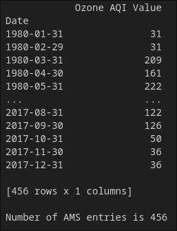
Now, the entries increased cause we are taking the maximum value among days of a given month.
Fit the MMS to a generalized extreme value (GEV) distribution.
fit = ss.genextreme.fit(ams)
print("Shape: ", fit[0])
print("Location: ", fit[1])
print("Scale: ", fit[2])
Shape:  -0.3799753177691755
Location:  73.59435631908137
Scale:  48.77164157425665
Plot the distribution again,
plt.hist(ams.iloc[:,0], bins=5, density=True, alpha=0.7, label='Data')
plt.plot(np.linspace(5, 300, 100),
         ss.genextreme.pdf(np.linspace(5, 300, 100), fit[0], fit[1], fit[2]), 'r--',
         label='GEV fit')
plt.title('GEV Distribution', fontweight='bold')
plt.xlabel('Ozone AQI value')
plt.ylabel('Probability')
plt.legend(loc='upper left')
plt.show()
Output:
Now, the distribution has changed drastically with the right-skewed curve. One reason it is happening is the dataset is now a little bit big.
What is the probability of exceeding an AQI of 200 in a given year? (Ozone levels above 200 are considered very unhealthy.)
prob_over_200 = (1.0 - ss.genextreme.cdf(200, fit[0], fit[1], fit[2]))
print('{:.2f}'.format(prob_over_200))
0.15
So, there is a 15 % chance that the AQI value will exceed 200 in a given year.
b. Peaks Over Threshold
What if you are not interested in the maxima in specific blocks, but want to know about exceeding a threshold more generally? For example, in the ozone case, an exceedance might occur several times a year or not at all in a given year. For such scenarios, the peak of threshold (POT) approach is more appropriate.
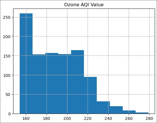
Let us look at all of the ozone data as a histogram.
ozone_aqi['Ozone AQI Value'].hist();
Output:
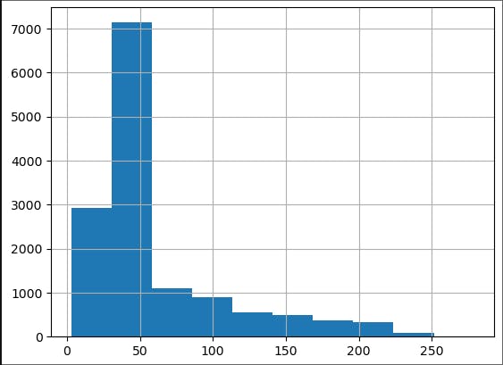
We note that most of the data is below an AQI of 100, which is considered moderate to good air quality. (Phew!) We are concerned about the high AQI tail, which can be a health hazard. As we discussed in the lecture, this tail should be well approximated by a universal distribution.
Workflow of POT
Choose a threshold.
Use only the data that is above the threshold.
Fit this data with a GPD distribution
The task of choosing the threshold for the tail requires some judgment. If it is too low, then the theorems about the universal behavior of the tail do not apply. If it is too high, then there will be few data points in the tail and the resulting estimates for the parameters will be poor. Often, it is a matter of trying different thresholds and looking for a good (enough) fit.
Here we will use a convenient rule of thumb for where to start the exploration: take the lowest value of the AMS.
min_max = ams.values.min()
print(f'Lowest maxima value for Ozone AQI in any year: {min_max}')
Output:
Lowest maxima value for Ozone AQI in any year: 151
Since we are going to try different values of the threshold, define an appropriate function to create the tail and plot it.
def plot_tail(threshold):
    ozone_aqi_over_threshold = ozone_aqi[ozone_aqi['Ozone AQI Value'] > threshold]
    ozone_aqi_over_threshold.hist()

plot_tail(min_max)
Output:
We expect the tail to be a decreasing function of the ozone AQI level and here we see a plateau from 170 to 210. Therefore, we will increase the threshold.
plot_tail(200)
Output:
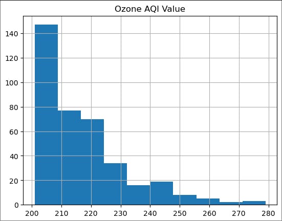
Looks more reasonable. As we discussed in lectures, let us first try to fit an exponential distribution.
threshold = 200
ozone_aqi_threshold = ozone_aqi[ozone_aqi['Ozone AQI Value'] > threshold].iloc[:,0]
fit_expon = ss.expon.fit(ozone_aqi_threshold)
print(fit_expon)
(201.0, 15.779527559055111)
Print the Location and Scale.
print("Location: ", fit_expon[0])
print("Scale: ", fit_expon[1])
Output:
Location:  201.0
Scale:  15.779527559055111
These are the location and scale parameters, respectively, for an exponential distribution of the form
$$exp [-(x-\mu)/\sigma]$$
Plot the results together with the exponential fit.
# linspace starts at 201 (one above threshold) to avoid fit going to zero, which looks ugly

plt.hist(ozone_aqi_threshold, bins=10, density=True, alpha=0.7, label='Tail')
plt.plot(np.linspace(201, 280, 100),
         ss.expon.pdf(np.linspace(201, 280, 100), fit_expon[0], fit_expon[1]), 'r--',
         label='Exponential fit')
plt.title('Exponential Distribution', fontweight='bold')
plt.xlabel('Ozone AQI value')
plt.ylabel('Probability')
plt.legend(loc='upper right')
plt.show()
Output:
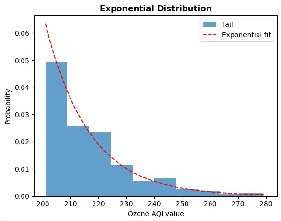
Not bad. We should repeat the analysis above with different thresholds.
Question: How would you decide which threshold to use from all of those you explored?
Answer: One way to choose a threshold is the one that gives the smallest mean squared error between the data and the fit.
As with the block maxima approach, we can now ask questions about different outcomes. Let's revisit the questions we asked before and compare answers.
A. What is the probability of exceeding an AQI of 200 in the period examined (38 years)?
Here the answer is 1.00, since we choose our threshold to be 200.
Previously, we found that the probability of exceeding 200 in a given year was 0.75. Therefore, the probability of exceeding 200 at least once in 38 years is,
$$1 - (1 - 0.75)^{38} \approx 1.00$$
which is the same as above.
B. Using the block maxima approach, we found that the ozone AQI which has a one percent probability of being exceeded in a given year is 281. Therefore, the probability that this level won't be exceeded over 38 years is
$$(1 - 0.01)^{38} \approx 0.6$$
From the POT analysis, the probability that the AQI level of 281 won't be exceeded over 38 years is given by
prob_over_200 = (1.0 - ss.expon.cdf(200, fit_expon[0], fit_expon[1]))
print('{:.2f}'.format(prob_over_200))
1.00
boundary = ss.expon.ppf(0.99, fit_expon[0], fit_expon[1])
print(f'The one percent threshold ozone AQI level is {boundary:6.4f}')
The one percent threshold ozone AQI level is 273.6674
For completeness, we can fit the data with a generalized Pareto distribution (GPD). As we discussed in lectures, the exponential distribution is a special case of the GPD (shape parameter is zero).
fit2 = ss.genpareto.fit(ozone_aqi_threshold, 20, loc=201, scale=16)
print(fit2)
(-0.06709510873892582, 200.99999967754965, 16.71263276563655)
plt.hist(ozone_aqi_threshold, bins=10, density=True, alpha=0.7, label='Tail')
plt.plot(np.linspace(201, 280, 100),
         ss.genpareto.pdf(np.linspace(201, 280, 100), fit2[0], fit2[1], fit2[2]), 'r--',
         label='GPD fit')
plt.legend(loc='upper right')
plt.show()
Output:

Very similar to what we found before for the exponential distribution.
Note: for a GPD fit to work, we need to specify initial guesses for all of the parameters. For the location and scale parameters, we chose the values we found for the exponential distribution. Try using different initial guesses and see what you get. Make sure you plot the fit and compare it with the data to check that genpareto.fit is producing reasonable output (sometimes it doesn't).
EVA: Final Thoughts
CAUTIONS
For EVA to give reasonable results, it is important to check that mathematical assumptions behind the theorems are met - eg. time series must be stationary
EVA will detect anomalies if they are maxima or minima. But what if the anomalies aren't either?
3. Angle Based Techniques
The essential idea is

Working Flow
Choose a point in the data
Calculate all angles that this point makes with other pairs of points in the data
Calculate the variance of these angles
Anomalies have low variance; normal points have high variance
Typically, you will have training data where you know the anomalies and so can derive a threshold for the variance below which the points will be classified as anomalies. You then apply this threshold to your test data.
Since here our focus is the algorithm and not the data, we won't carry out a test/train split. Instead, we will use simulated data where we know the anomalies and see how well the algorithm performs.
a. Data
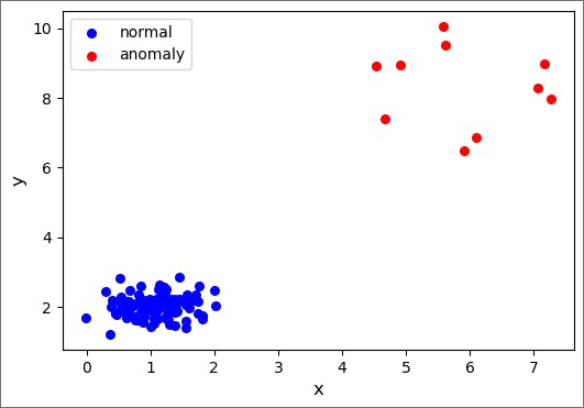
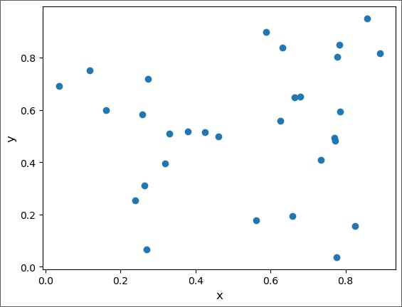
We start by creating the data, which will be a combination of normal points and anomalies. Each set of points (normal and anomaly) is generated from a 2D Gaussian distribution where we specify the mean in each dimension as well as the covariance matrix. We choose the normal data to be 100 points tightly clumped together, while the anomalies are 10 points that are further away and spread out more broadly.
import numpy as np
np.random.seed(16) # include a seed for reproducibility

# generate the normal data
normal_mean = np.array([1.0, 2.0])
normal_covariance = np.array([[0.2, 0.0], [0.0, 0.1]])
normal_data = np.random.multivariate_normal(normal_mean, normal_covariance, 100)

# generate the anomalous data
anomaly_mean = np.array([6.0, 8.0])
anomaly_covariance = np.array([[2.0, 0.0], [0.0, 4.0]])
anomaly_data = np.random.multivariate_normal(anomaly_mean, anomaly_covariance, 10)


# Combine the data into one array for later use
all_data = np.concatenate((normal_data, anomaly_data), axis=0)
Let's plot the data points.
import matplotlib.pyplot as plt

fig = plt.figure(figsize=(6,4))
ax1 = fig.add_subplot(111)

ax1.scatter(normal_data[:,0], normal_data[:,1], s=30, c='b', marker="o", label='normal')
ax1.scatter(anomaly_data[:,0], anomaly_data[:,1], s=30, c='r', marker="o", label='anomaly')
plt.legend(loc='upper left');
plt.xlabel('x', fontsize=12)
plt.ylabel('y', fontsize=12)
plt.show()
Output:
b. Method
We will first implement a true angle-based algorithm. That is, we calculate the actual angles for each set of three points in the data.
We start by constructing the two key functions for the angle-based anomaly detection algorithm. The first function, angle, calculates the angle between three points.
# Given points A, B and C, this function returns the acute angle between vectors AB and AC
# using the dot product between these vectors

def angle(point1, point2, point3):
    v21 = np.subtract(point2, point1)
    v31 = np.subtract(point3, point1)
    dot_product = (v21*v31).sum()
    normalization = np.linalg.norm(v21)*np.linalg.norm(v31)
    acute_angle = np.arccos(dot_product/normalization)
    return acute_angle
The second function, eval_angle_point, takes two inputs: a point and data (a collection of points). This function returns a list of angles that the input point makes with all pairs of points in the input data. It uses the angle of the angle calculation.
def eval_angle_point(point, data):
    angles_data = []
    for index_b, b in enumerate(data):
        if (np.array_equal(b, point)):
            continue
        # ensure point c comes later in array that point b
        # so we don't double count points
        for c in data[index_b + 1:]:
            if (np.array_equal(c, point)) or (np.array_equal(c, b)):
                continue
            angles_data.append(angle(point, b, c))
    return angles_data
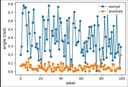
Choose a normal point and an anomaly at random and plot the angles made for 100 pairs of points in the data.
fig2 = plt.figure(figsize=(6,4))
ax2 = fig2.add_subplot(111)
np.random.seed(17)
normal_point = random.choice(normal_data)
anomaly_point = random.choice(anomaly_data)
normal_angles = eval_angle_point(normal_point, all_data)
anomaly_angles = eval_angle_point(anomaly_point, all_data)
ax2.plot(normal_angles[0:100],  marker="o", label='normal')
ax2.plot(anomaly_angles[0:100], marker="o", label='anomaly')
plt.xlabel('label', fontsize=12)
plt.ylabel('angle (rad)', fontsize=12)
plt.legend(loc='best')
plt.savefig('angle_based.png', dpi=600) # for use in the lecture
plt.show()
Output:

From the above figure, we can see that the angles made by normal points with all other data vary largely while the angles made by anomalous points do not vary much.
print('The normal point is {}'.format(normal_point))
print('The variance in angle for the normal point is {:.5f}'.format(np.var(normal_angles)))
print('The anomaly point is {}'.format(anomaly_point))
print('The variance in angle for the anomaly point is {:.5f}'.format(np.var(anomaly_angles)))
The normal point is [0.84799901 2.04845137]
The variance in angle for the normal point is 0.83330
The anomaly point is [7.16143734 8.98741849]
The variance in angle for the anomaly point is 0.09152
This two-point comparison looks promising but is not statistically meaningful.
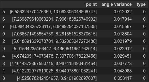
Let's calculate the angle variance for all the anomaly data. We will label the anomalies with type '0' so we can compare them with the normal data (type '1') below.
df_anomaly = pd.DataFrame(columns=['point','angle variance','type'])
for index, item in enumerate(anomaly_data):
    df_anomaly.loc[index] = [item, np.var(eval_angle_point(item, all_data)), 0]

df_anomaly.head(10)
Output:
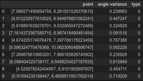
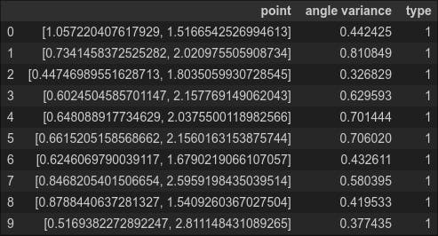
This is a little disconcerting. The angle variance for many of the anomalies is quite high--higher even than the variance of the normal point we considered above. To complete our analysis, we also need the variance for the normal data, which we calculate below (labeling normal data as type '1')
df_normal = pd.DataFrame(columns=['point','angle variance','type'])
for index2, item2 in enumerate(normal_data):
    df_normal.loc[index2] = [item2, np.var(eval_angle_point(item2, all_data)), 1]
df_normal.head(10)
Output:
Question: Why is the calculation for normal_data relatively slow? (Hint: What is the complexity of the algorithm?)
Answer: The complexity of the algorithm is O(N^3) where N is the number of points.
To see this, think about how an angle is calculated. You need three points, and they should all be different. There are N ways to choose the first point, N-1 ways to choose the second one, and N-2 to choose the third. Swapping the second and third points gives the same angle, so the overall complexity is N*(N-1)*(N-2)/2 = O(N^3).
Combine the two data frames for the anomalies and the normal points and sort them in ascending order by angle variance. If our anomaly detection algorithm is perfect, then the first ten entries should all be anomalies (type 0).
df_all = pd.concat([df_anomaly, df_normal], ignore_index=True)
df_all.sort_values(by=['angle variance']).head(10)
Output:

Oops! We find only five of the ten anomalies and the two points with the lowest variance belong to the normal data. Our algorithm needs some work.
To improve the result,
A. Change the angle calculation so that it computes a modified angle between two vectors a and b:
$$\begin{equation} \theta_{\rm mod} = \frac{\bf{a} \dot \bf{b}}{a^{2}b^{2}} \end{equation}$$
where a and b are the absolute values of a and b.
Repeat the steps above,
# Given points A, B and C, this function returns the acute angle between vectors AB and AC
# using the dot product between these vectors

def angle2(point1, point2, point3):
    v21 = np.subtract(point2, point1)
    v31 = np.subtract(point3, point1)
    dot_product = (np.absolute(v21)*np.absolute(v31)).sum()
    normalization = np.linalg.norm(v21)*np.linalg.norm(v31)
    acute_angle = np.arccos(dot_product/normalization)
    return acute_angle
def eval_angle_point2(point, data):
    angles_data = []
    for index_b, b in enumerate(data):
        if (np.array_equal(b, point)):
            continue
        # ensure point c comes later in array that point b
        # so we don't double count points
        for c in data[index_b + 1:]:
            if (np.array_equal(c, point)) or (np.array_equal(c, b)):
                continue
            angles_data.append(angle2(point, b, c))
    return angles_data
fig2 = plt.figure(figsize=(6,4))
ax2 = fig2.add_subplot(111)
np.random.seed(17)
normal_point = random.choice(normal_data)
anomaly_point = random.choice(anomaly_data)
normal_angles = eval_angle_point2(normal_point, all_data)
anomaly_angles = eval_angle_point2(anomaly_point, all_data)
ax2.plot(normal_angles[0:100],  marker="o", label='normal')
ax2.plot(anomaly_angles[0:100], marker="o", label='anomaly')
plt.xlabel('label', fontsize=12)
plt.ylabel('angle (rad)', fontsize=12)
plt.legend(loc='best')
plt.savefig('angle_based.png', dpi=600) # for use in the lecture
plt.show()
Output:
Now, normal data vary more drastically as compared to the previous.
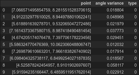
Let's calculate the angle variance for all the anomaly data. We will label the anomalies with type '0' so we can compare them with the normal data (type '1') below.
df_anomaly = pd.DataFrame(columns=['point','angle variance','type'])
for index, item in enumerate(anomaly_data):
    df_anomaly.loc[index] = [item, np.var(eval_angle_point2(item, all_data)), 0]
df_anomaly.head(10)
Output:
Again, to complete our analysis, we also need the variance for the normal data, which we calculate below (labeling normal data as type '1')
df_normal = pd.DataFrame(columns=['point','angle variance','type'])
for index2, item2 in enumerate(normal_data):
    df_normal.loc[index2] = [item2, np.var(eval_angle_point2(item2, all_data)), 1]
Concat, both the data frame.
df_all = pd.concat([df_anomaly, df_normal], ignore_index=True)
df_all.sort_values(by=['angle variance']).head(10)
Nice, all 10 are the anomaly. So in this data, the changing of the formula for calculating an angle works.
4. Depth Based Techniques
In this section, we use depth-based anomaly detection to detect anomalies in simulated two-dimensional data. Just like angle-based anomaly detection, depth-based anomaly detection uses the geometric structure of the data, rather than an underlying probability distribution, to find anomalies.
While it is clear what we mean by angle, the concept of depth must be defined. The general idea of depth is to assign a numerical value to each point. As with angle variance, points below a certain value of depth are considered anomalies.
Here we will take the depth to be the convex-hull peeling depth as defined below.
The depth of a point X concerning a dataset S (made of many points including X)is the level of the convex layer to which X belongs.
The level of the convex layer is defined as follows: the points on the outer convex hull of S are designated level one and the points on the jth level (with j a positive integer) are the points on the convex hull of S after the points on all previous levels have been removed.

Workings
Construct the convex hull for the data
Label the points on the hull as depth 1
Remove the depth 1 points
Construct the convex hull for the remaining data
Label the points on the hall as depth 2
Remove the depth 2 points
Continue steps (4-6) incrementing the depth level by one each time
Once there aren't enough points left to construct a convex hull, increment the depth, label the remaining points (if any) with the final depth value, and end the convex hull construction
The anomalies are those points whose depth values are below a pre-selected threshold
Given the structure of the algorithm, we expect to implement it recursively.
a. Data
We will illustrate the algorithm with a 2D dataset. As we mentioned in the lecture, the depth-based slows down significantly as the dimensionality increases. We will work with a small dataset for visual clarity.
Select 30 random points from a 2D uniform distribution between zero and one.
import numpy as np

np.random.seed(20)
points = np.random.rand(30, 2)
Plot the data
import matplotlib.pyplot as plt

plt.plot(points[:, 0], points[:, 1], 'o')
plt.xlabel('x', fontsize=12)
plt.ylabel('y', fontsize=12)
plt.show()
Output:
b. Method
We will construct a series of convex hulls. Let's look at the one for all the data, which produces the points of depth 1. There is a ready-made Python function to construct the convex hull.
from scipy.spatial import ConvexHull
hull = ConvexHull(points)
Plot the convex hull
plt.plot(points[:, 0], points[:, 1], 'o')
plt.xlabel('x', fontsize=12)
plt.ylabel('y', fontsize=12)
for simplex in hull.simplices:
    # In 2D, the simplicies are the lines connecting the points on the hull
    plt.plot(points[simplex, 0], points[simplex, 1], 'k-')
plt.show()
Output:

The function depth_calculator receives three inputs: the data, a dictionary to store coordinates and depths, and a counter to track depth, initially set to the outermost hull's depth.
def depth_calculator(data, dict, count):
    next_data = []
    if len(data) < 3: # in 2D, at least three points are needed to make a convex hull
        for index, item in enumerate(data):
            dict[tuple(item)] = count # assign depth to remaining points
        print('All done! Need at least 3 points to construct a convex hull. ')  # End
    else:
        hull = ConvexHull(data) # Construct convex hull
        for index, item in enumerate(data):
            if item in data[hull.vertices]: # hull.vertices=index
                dict[tuple(item)] = count # assign depth to points on hull
            else:
                dict[tuple(item)] = count + 1.0 # assign depth+1 to points not on hull
                next_data.append(item)
        new_data =np.asarray(next_data) # create new data file of points not on hull
        depth_calculator(new_data, dict, count + 1.0) # repeat on new data file
depth_dict = {} # empty dictionary for depth_calculator
depth_calculator(points, depth_dict, 1.0) # initial hull has depth 1.0
All done! Need at least 3 points to construct a convex hull.
print(depth_dict)

Let's create a function to plot the points with their depth.
def depth_plot (dict):
    xs,ys = zip(*dict.keys())
    depth_label = list(dict.values())
    plt.figure(figsize=(8,6))
    plt.title('Depth Labels', fontsize=20)
    plt.xlabel('x', fontsize=15)
    plt.ylabel('y', fontsize=15)
    plt.scatter(xs, ys, marker = 'o',)
    for label, x, y in zip(depth_label, xs, ys):
        plt.annotate(label, xy = (x, y), xytext=(3,3), textcoords='offset points')

depth_plot(depth_dict)
Output:
You can see in this plot that points labeled '1.0' are those on the initial convex hull. Also, the final three points (depth 5.0) formed a triangle after which no points were left and the algorithm ended.
Assuming we had set initially our anomaly threshold to be 1.0, we would have eight anomalies. Of course, in this case, there would be no need for a recursive approach--just take the points on the outermost convex hull. However, sometimes the depth is used as a score (a measure of how anomalous a point is). In such cases, it is useful to label all points.
5. Conclusion
If you are with me up until this point, I would be very thankful to you. After acquiring knowledge of probability distribution, and extreme value analysis, you can now go further into a more advanced way of implementing extreme value analysis. Additionally, you implemented both angle-based and depth-based anomaly detection which are wonderful methods to utilize the structure of the data.
Specifically, you have gained knowledge of:
Know probabilistic models for anomaly detection
Apply extreme value analysis
Apply angle-based and depth-based techniques
Apply anomaly detection on one- and two-dimensional data using Python*.
Always remember one thing all these methods do not apply to all kinds of datasets. Each method is applied to a particular nature of the dataset.
If you still have questions, don’t hesitate to reach out to me at suraj.karki500@gmail.com or in the comments section below!
If you want to learn more theoretical kinds of stuff, please check out the references below.
An Introduction to Statistical Modeling of Extreme Values by S. Coles (Springer- Verlag 2001)
Angle-Based Outlier Detection in High-Dimensional Data by H.-P. Kriegel, M. Schibert, A. Zimek (2008)
Outlier Detection Techniques by H.-P. Kriegel, P. Kröger, A. Zimek (2010)
This much for today; see you in the next blog. Take care! Cheers!